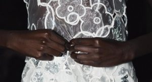
Every new season brings its own shades or rather, its subtle undertones. This fall, the wardrobe revolves around neutral hues and muted contrasts. Softened khaki, faded lilac, brick red, deep charcoal… Colors are no longer shouted, but whispered. Clothing turns into a canvas, a reflection of a more inward state of mind. More than just a palette, these tones sketch out a gentler way of inhabiting the season.
Color trends that are here to stay
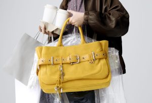
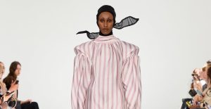
Fall 2025 isn’t about a color revolution, but about refining how we wear it. Certain shades feel like instant essentials: olive, chocolate brown, lavender, grey, grass green, butter yellow, and mustard. Tones that are neither too bold nor completely muted, striking a delicate balance between light and depth.
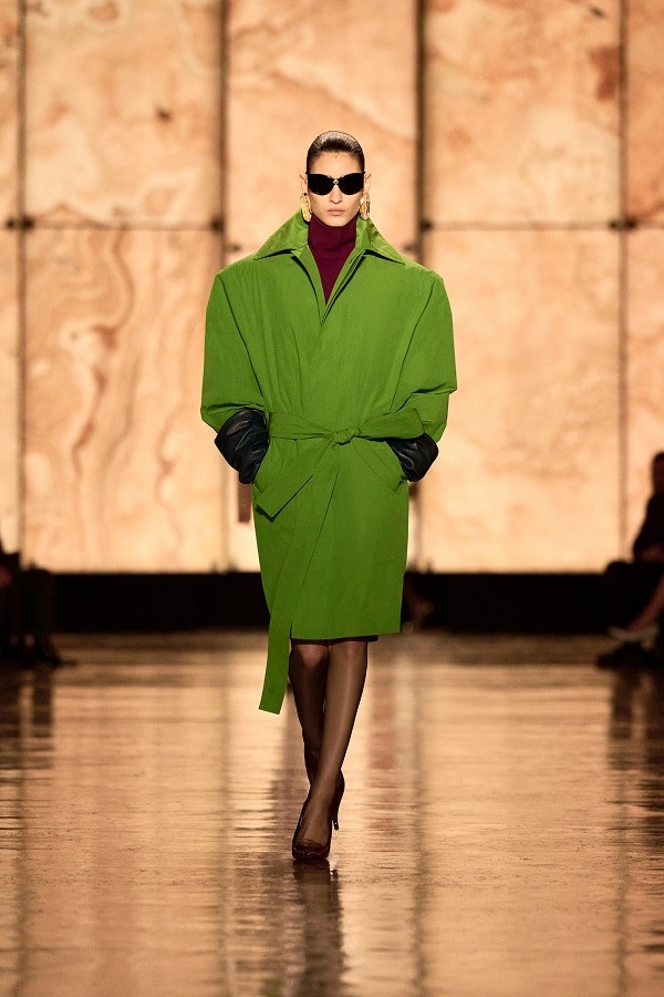
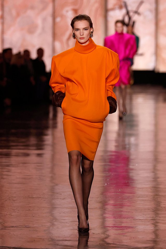
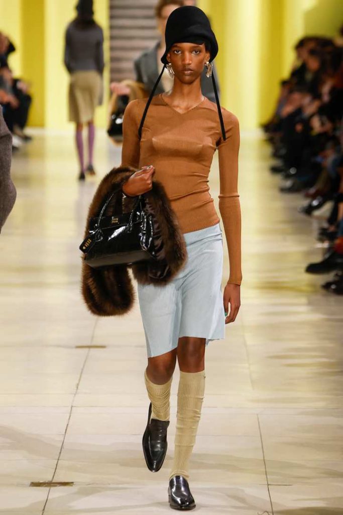
Their strength? They easily blend well with one another: olive pairs beautifully with grey, grass green cuts sharply against brown, and lavender glows when set beside butter yellow. Whether worn as discreet accents or bold color blocks as seen at Miu Miu and Saint Laurent, these shades redraw the contours of the autumn silhouette with a modern edge.
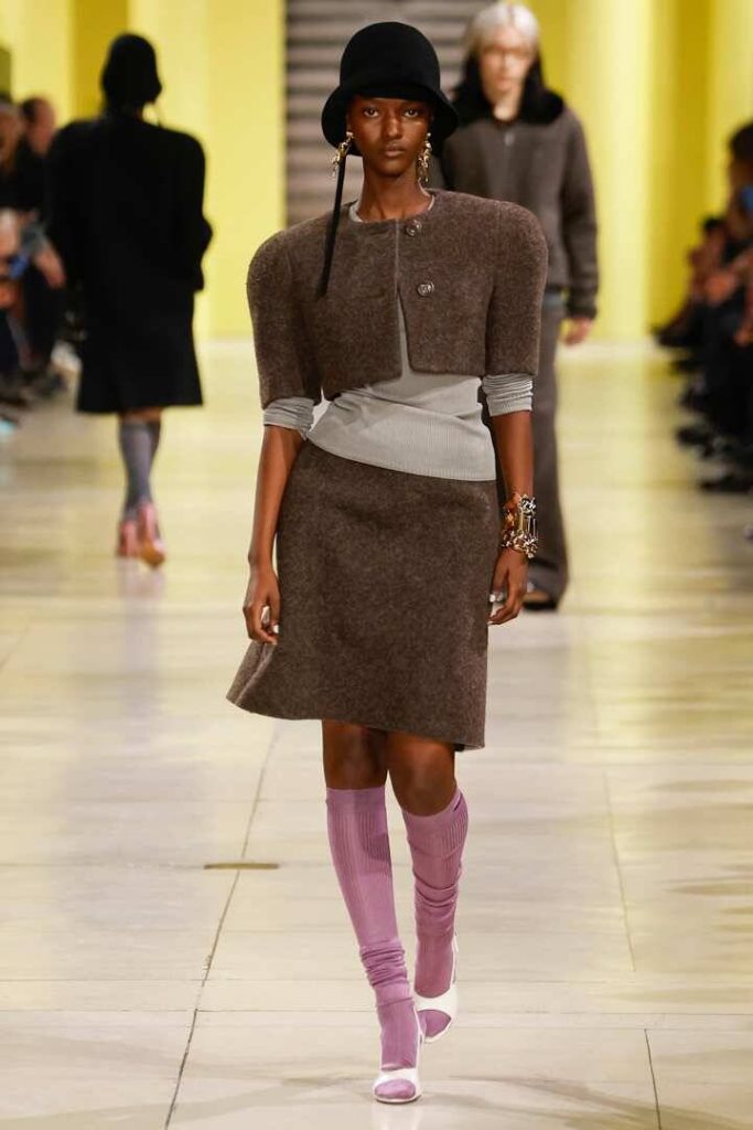
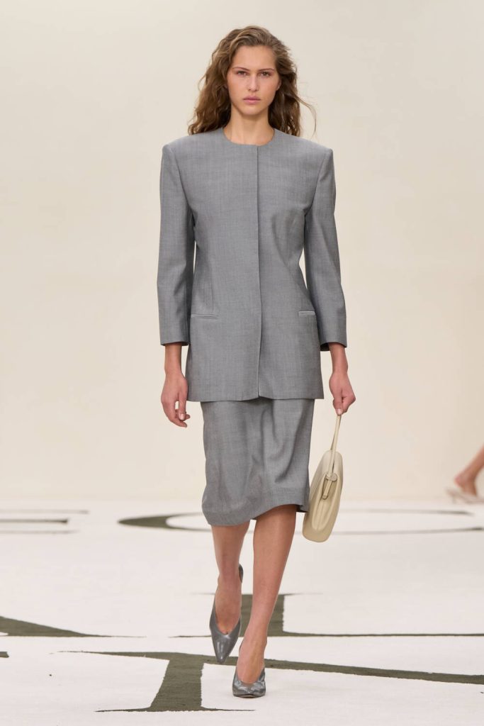
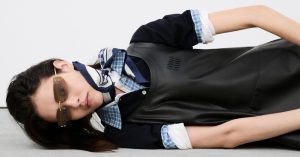
At Calvin Klein, grey even becomes the very foundation of the silhouette: reimagined as a straight-cut suit with understated elegance, it pairs effortlessly with brighter tones. In the most minimal combinations, color acts as a visual accent. A lavender clutch against raw denim, a fitted mustard blouse beneath a deep-black jacket, a chalk-white shirt under a chocolate coat. A wardrobe that embraces a colored minimalism, discreet yet sharply defined.
When everyday life turns into a mood board
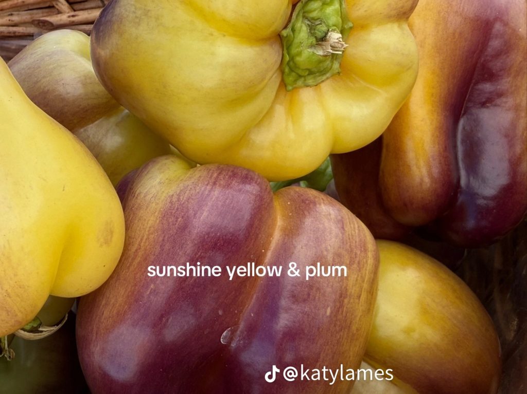
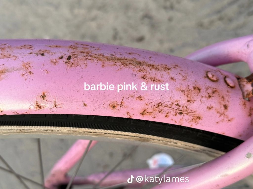
This return to a more instinctive, more sensorial palette is also reflected in the way we look at our surroundings. On TikTok, creators like Katy Lames and Marc Ranger turn their daily walks into true chromatic compositions. A sea-green façade, a butter-yellow wall, a branch in rust and moss tones, a faded lilac poster against brick… every detail becomes a source of inspiration.
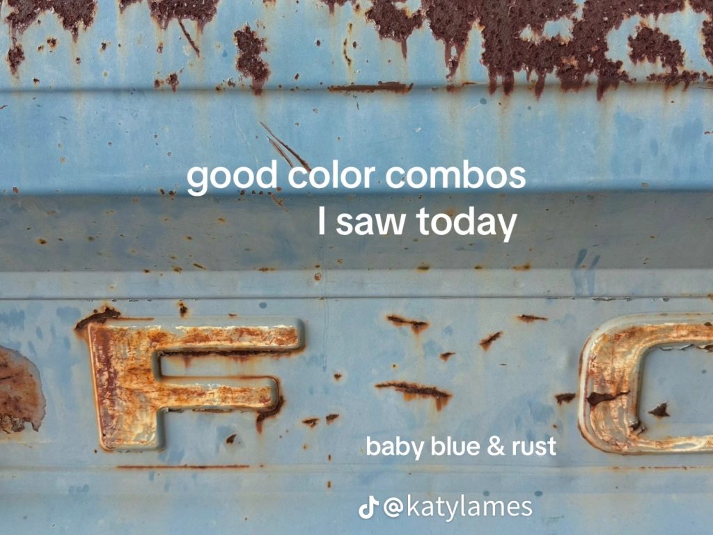
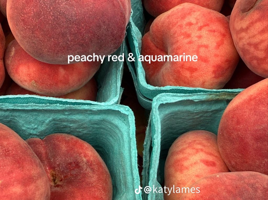
Canadian artist Marc Ranger, who dedicates his entire account to these visual harmonies, sums it up in his bio: ‘Noticing and sharing’: an invitation to see differently. For her part, Katy Lames describes her wanderings as a playful exercise: Life becomes a joyous game of eye spy.
These posts capture a new way of thinking about color: no longer as a trend dictated by the runways, but as a living language, drawn directly from everyday objects, textures, and landscapes. A kind of visual dictionary where each pairing, however simple, tells a story or stirs an emotion.
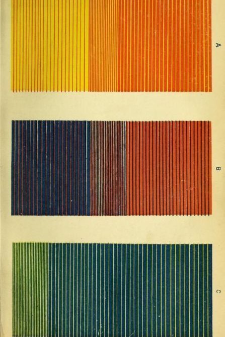
For those hesitant to embark on chromatic adventures, color association guides can be found in bookstores and specialty shops. Their appeal? They’re just as useful for getting dressed as they are for decorating your home. And for creative souls, they become a valuable tool for designing ceramics, sketches, or paintings. An accessible resource to learn how to compose, to feel, and to translate an atmosphere into visual form.
Color as a starting point
Before even speaking of clothes, it’s about first learning to notice the right colors around us. In the walls of a city, in a museum sketchbook, in a café tablecloth or the glow of a late afternoon. The shades of fall are already here, within sight, often overlooked.
Stylists know it well: many mood boards are born from a stone wall, an open book, a ripe fruit. What if Autumn 2025 were an invitation to relearn how to see? A season to slow down, hone our gaze, and compose a wardrobe the way one composes an image: with meaning, balance, and a generous dose of intuition.